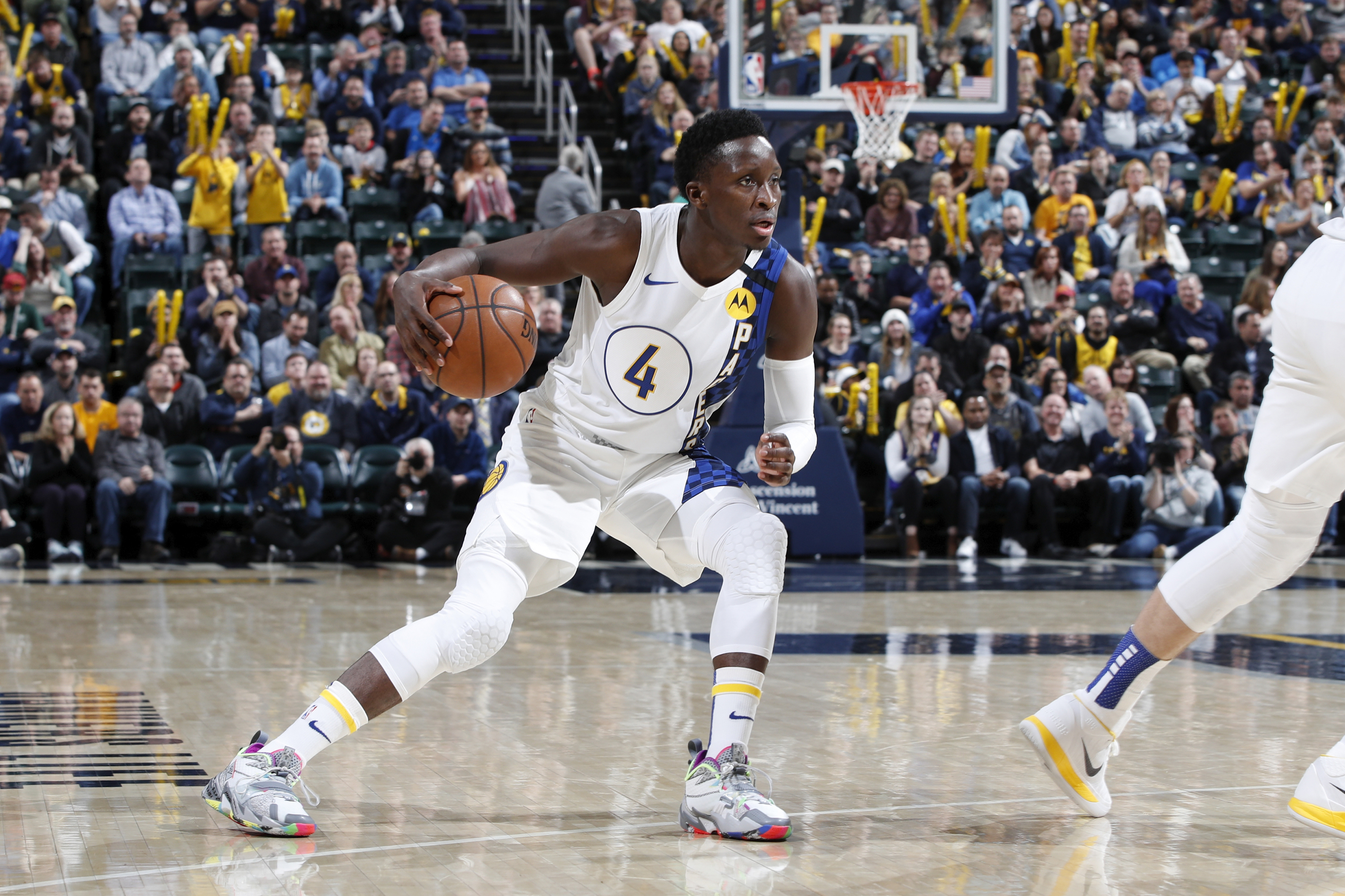
2020 NBA Playoff Jerseys
Inspired by the 2020 NBA basketball bubble organized in Florida to conclude the Covid19-interrupted season. During the bubble, regular season and playoff games were played in a condensed fashion and fans were able to watch basketball throughout most of the day and night, which was a real comfort during extended hours indoors. The bubble culminated in what I thought was a somewhat beautiful result of champion in the Los Angeles Lakers, at the end of the year in which Kobe Bryant tragically passed. Even as someone who does not root for the Lakers, I enjoyed seeing them win it all for that reason. RIP Mamba.
October 2020
Color-aid paper cut-out NBA jerseys of ten teams in the 2020 Playoffs. Hand-cut, laid with rubber cement, and scanned into digital form.
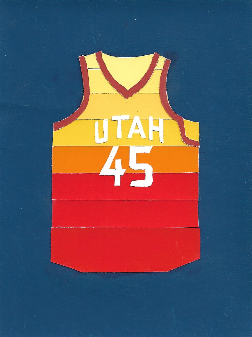
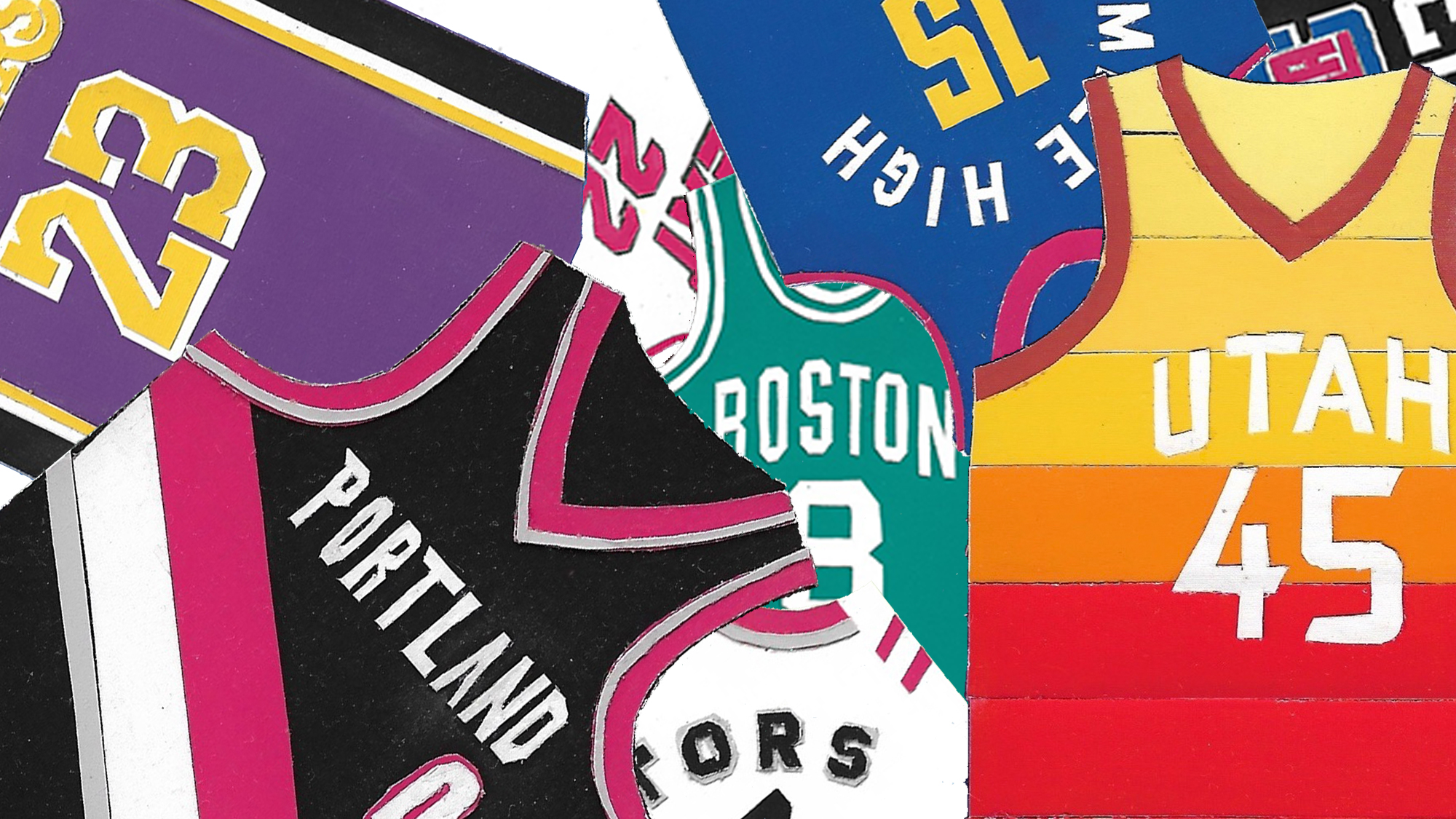
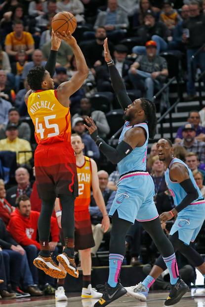
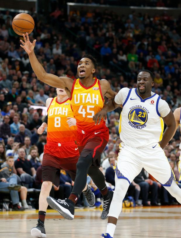
Utah Jazz City Edition
(Donovan Mitchell)
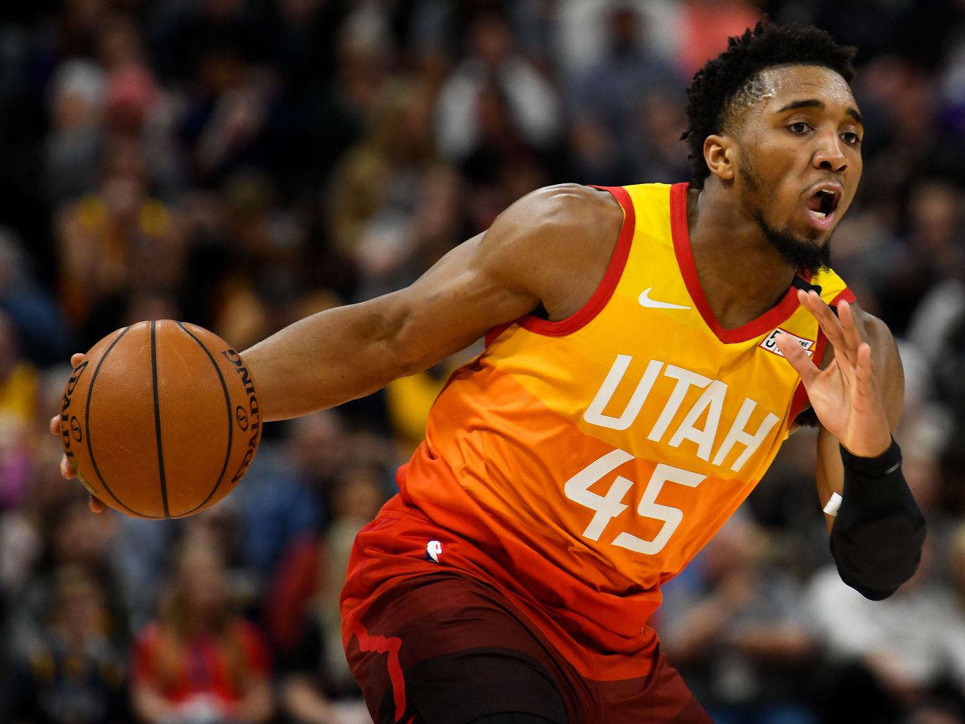
My favorite NBA jersey of the modern Nike era. A highly ambitious idea executed well. True to the theme of a jersey that is visually meant to represent the team’s location, the Utah Jazz City Edition jerseys utilize a yellow to red colorblocked gradient in homage to the red rock formations across the southern end of the state. It is the most eye-catching uniform in the NBA today, and tastefully so. A slightly asymmetrical jersey, the likes of which I usually find more intruiging than their symmetrical counterparts. Worn several times in the 2020 bubble at Disney Land, Donovan Mitchell was being lauded as a potential ‘Bubble MVP’ for his elevated performance during those games.
_______
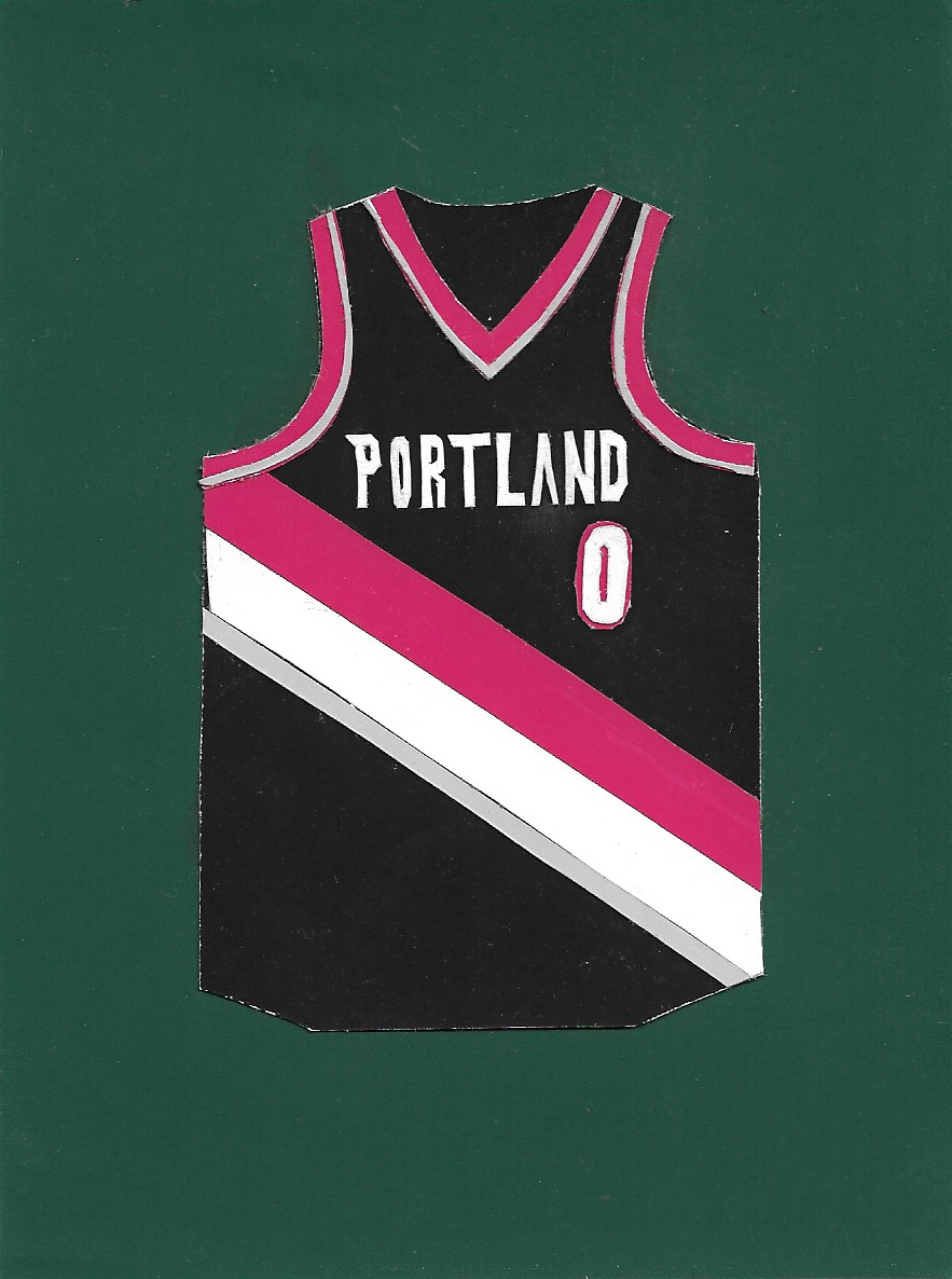
Portland Trailblazers Icon Edition
(Damian Lillard)
Frequently my favorite jersey and favorite player in the NBA. Deemed the 2020 ‘Bubble MVP,’ Damian Lillard’s performance and long-range shooting lead the Trailblazers to the highly coveted 8th seed in the Western Conference by a hair. Another great example of a well executed asymmetrical uniform. I am satisfied with Nike’s iteration of the Blazer’s jersey. They made slight, tasteful changes to this classic uniform, which has only seen minor tweaks since the ‘80s. This consistency speaks to the jersey’s timelessness, a timelessness that exists in the overall branding of the Trailblazers.
_______
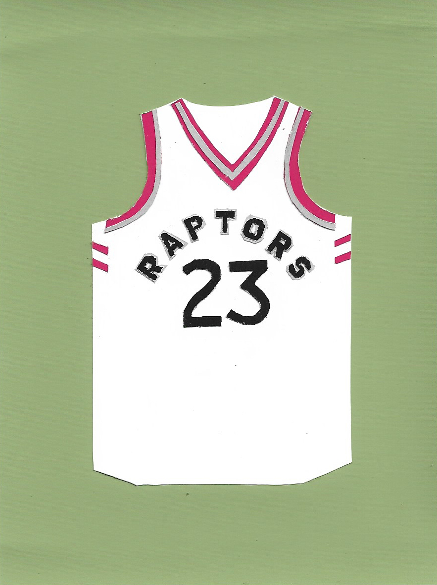
Toronto Raptors Icon Edition
(Fred VanVleet)
Nike’s jersey set for the Toronto Raptors is simple and successful. I generally am not interested in modern day over-simplification or sterilization of design, but I think that the Raptors’ current uniforms are a good example of success with this digital-era method. Extreme crispness and simplicity achieved through color and lettering.
_______
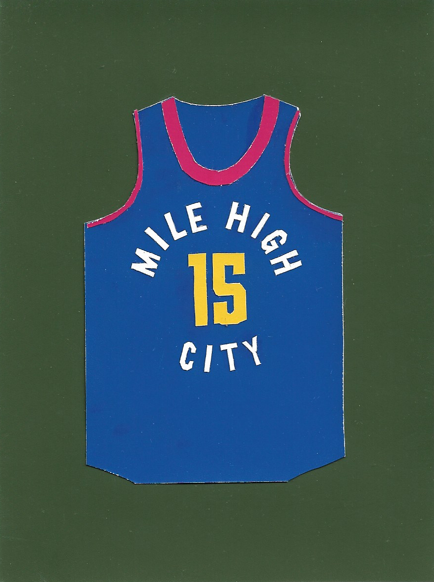
Denver Nuggets Statement Edition
(Nikola Jokić)
My favorite current day Denver jersey. I like when all three primary colors are utilized in a design and how simple these uniforms are. While simple, these jerseys did something uncommon with their title and composition of lettering. Instead of “DENVER,” or “NUGGETS,” “MILE HIGH CITY,” is arranged in a distinct circular formation around the front number of the uniform.
_______
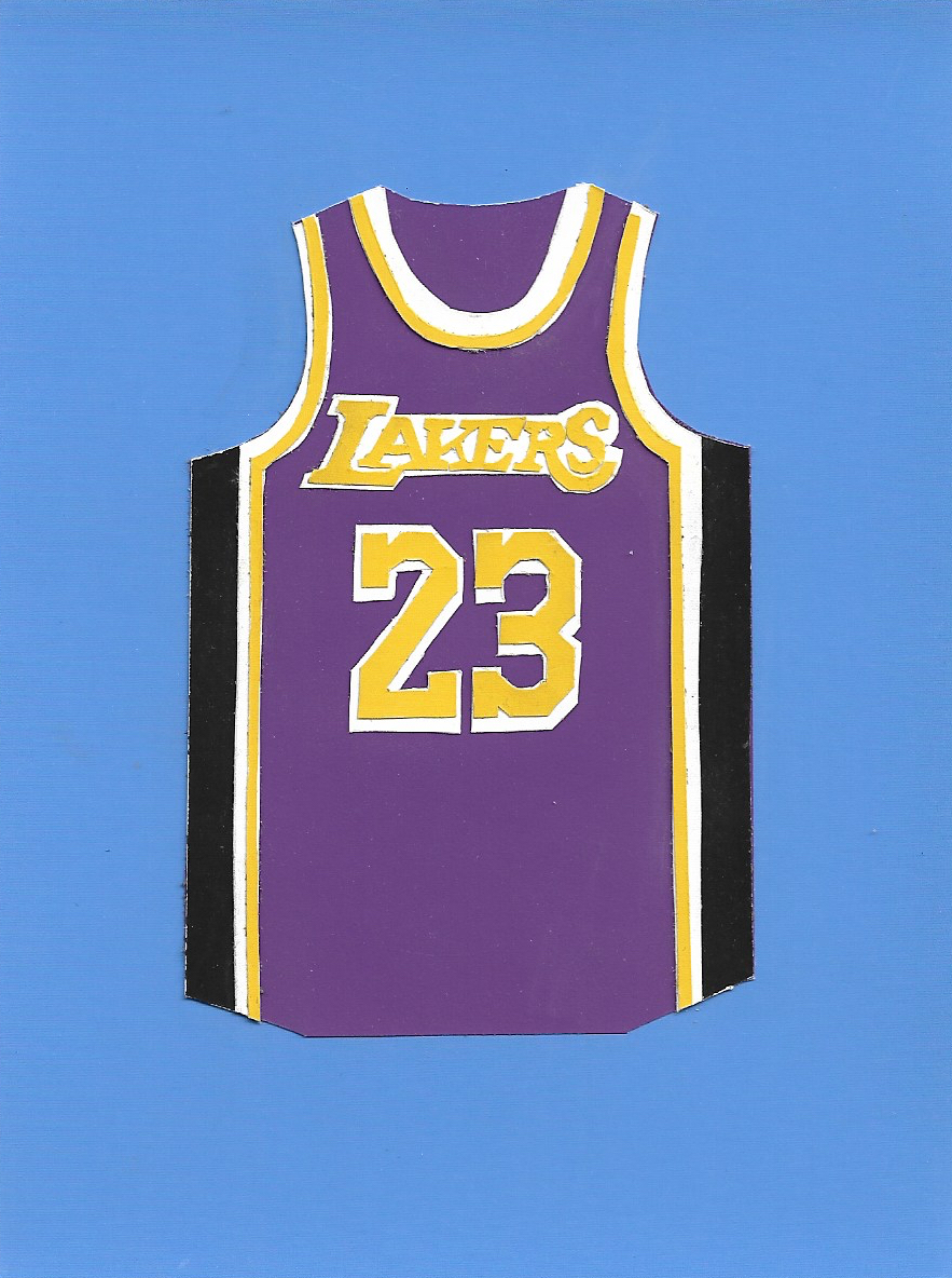
Los Angeles Lakers Statement Edition
(LeBron James)
I am a fan of Nike’s version of this classic. What strikes me as a modern touch on these timeless jerseys is the way Nike sent the sleeve trim down the full length of the uniforms in a continuous line around the leg opening of the shorts. The black side panels run the length of the uniforms between the taping.


_______
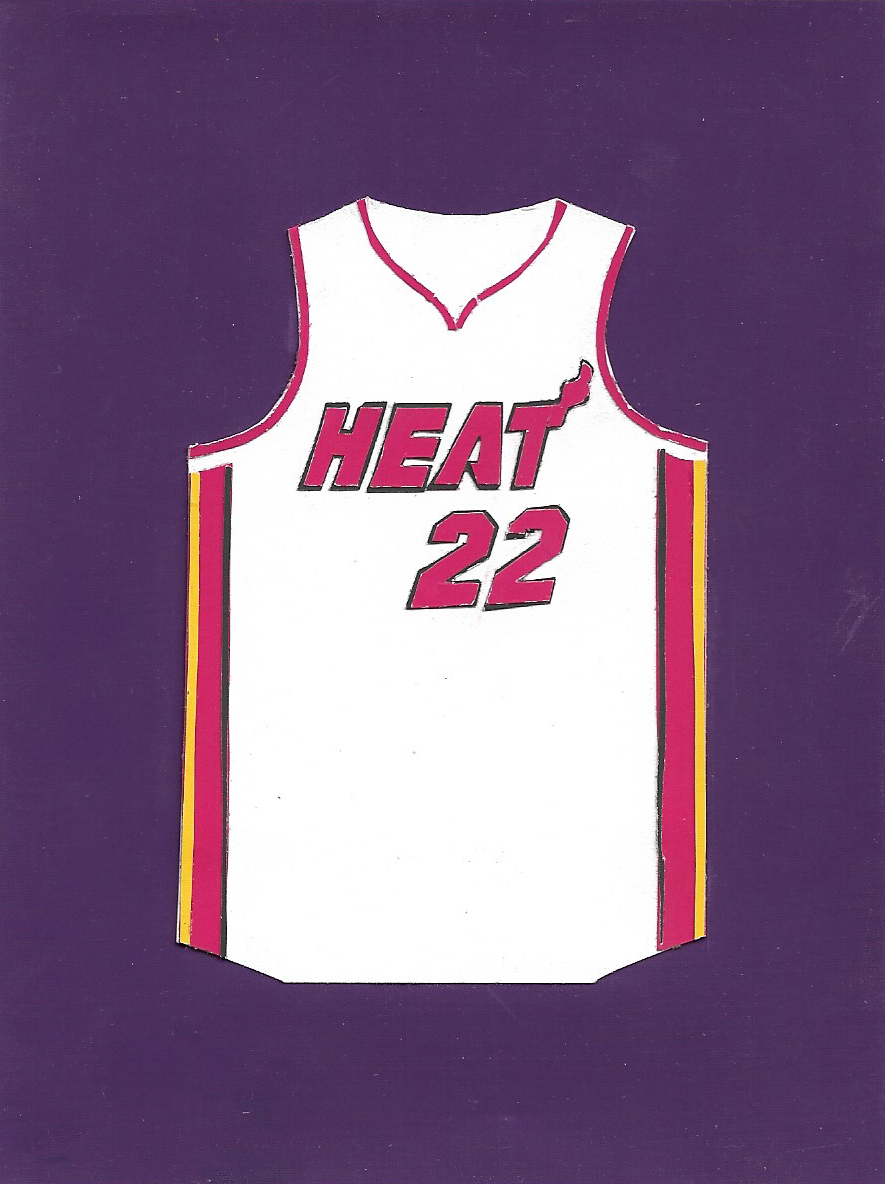
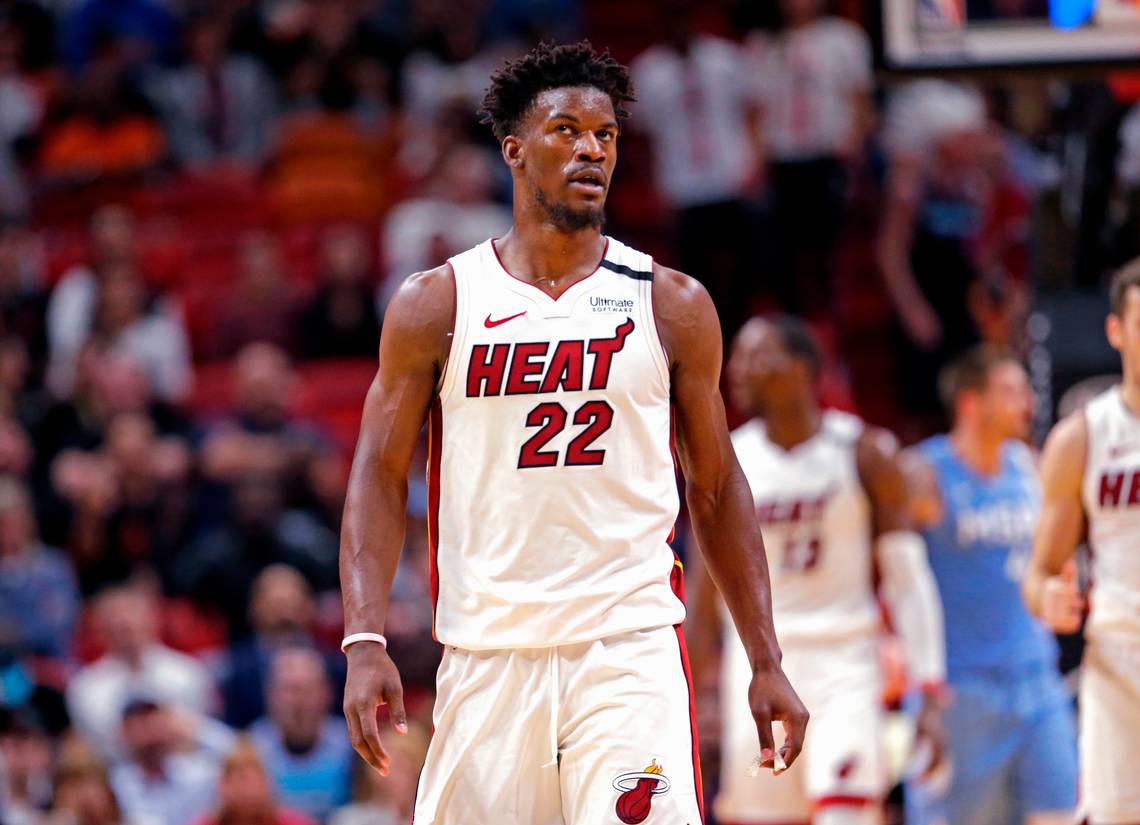
Miami Heat Icon Edition
(Jimmy Butler)
Mostly unchanged by Nike, the Miami Heat’s Icon Edition still a well-functioning home uniform with iconic lettering.

_______
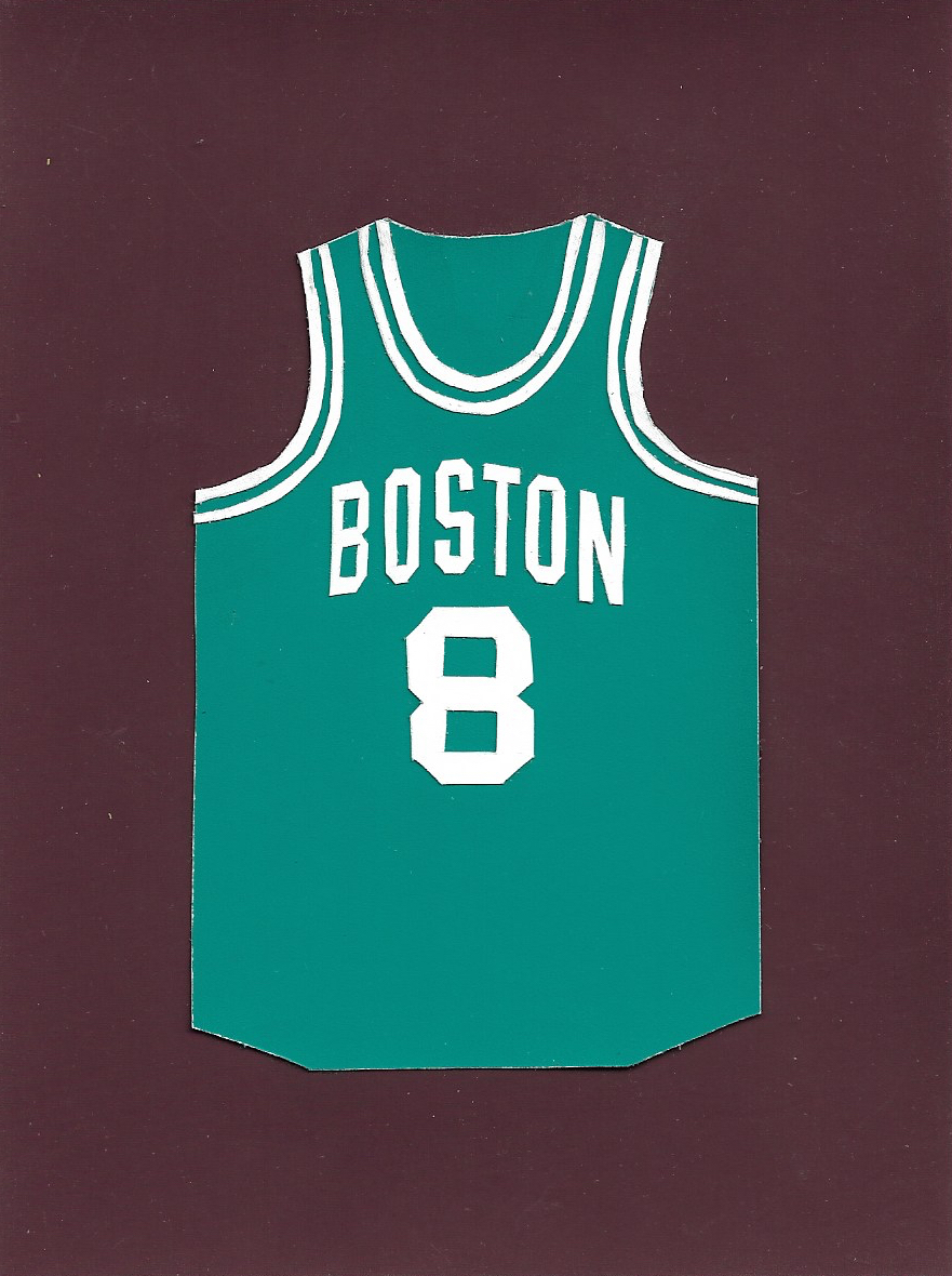
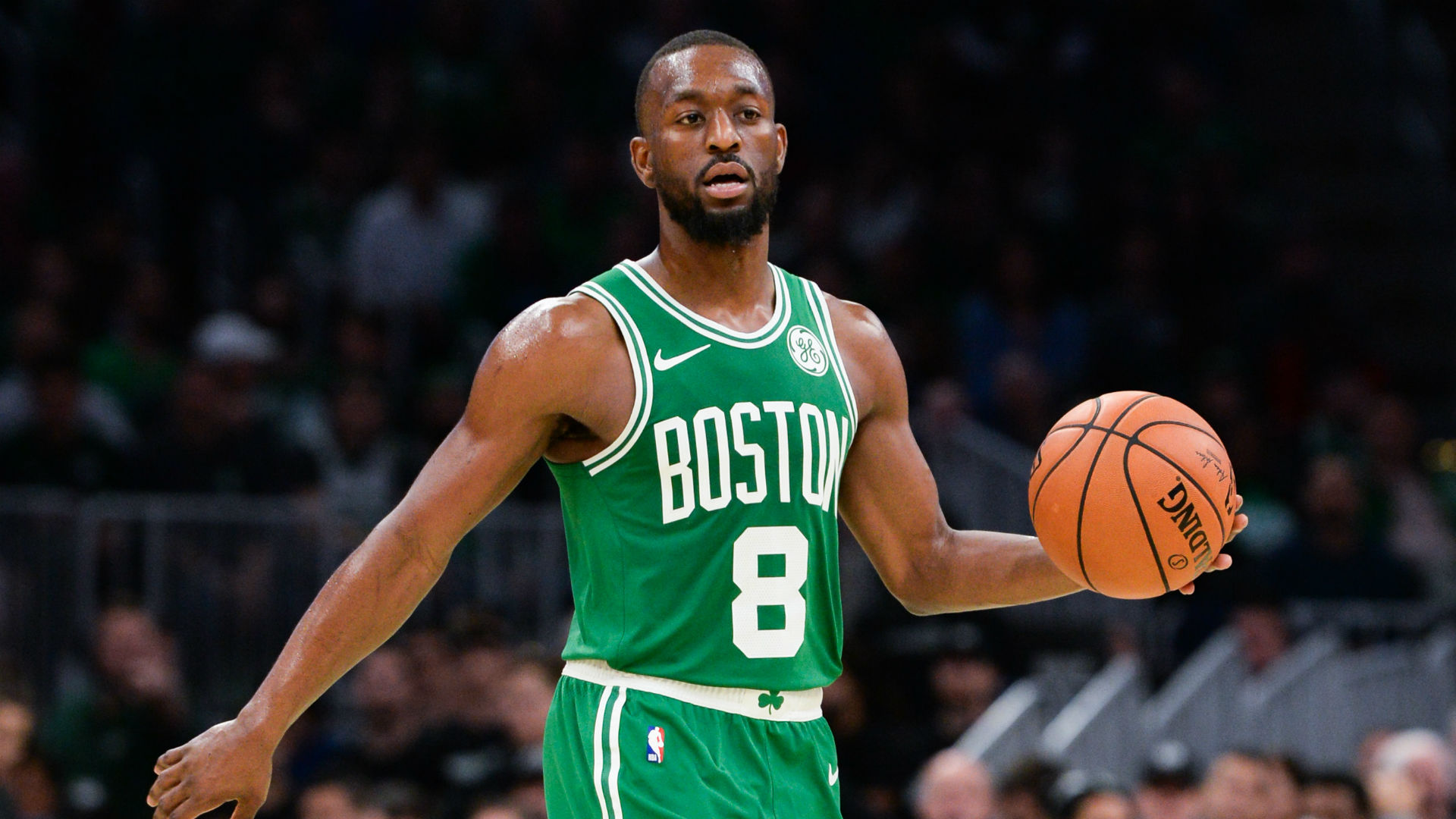
Boston Celtics Icon Edition
(Kemba Walker)
An all time classic left mostly untouched by Nike other than increased letter and number size.

_______
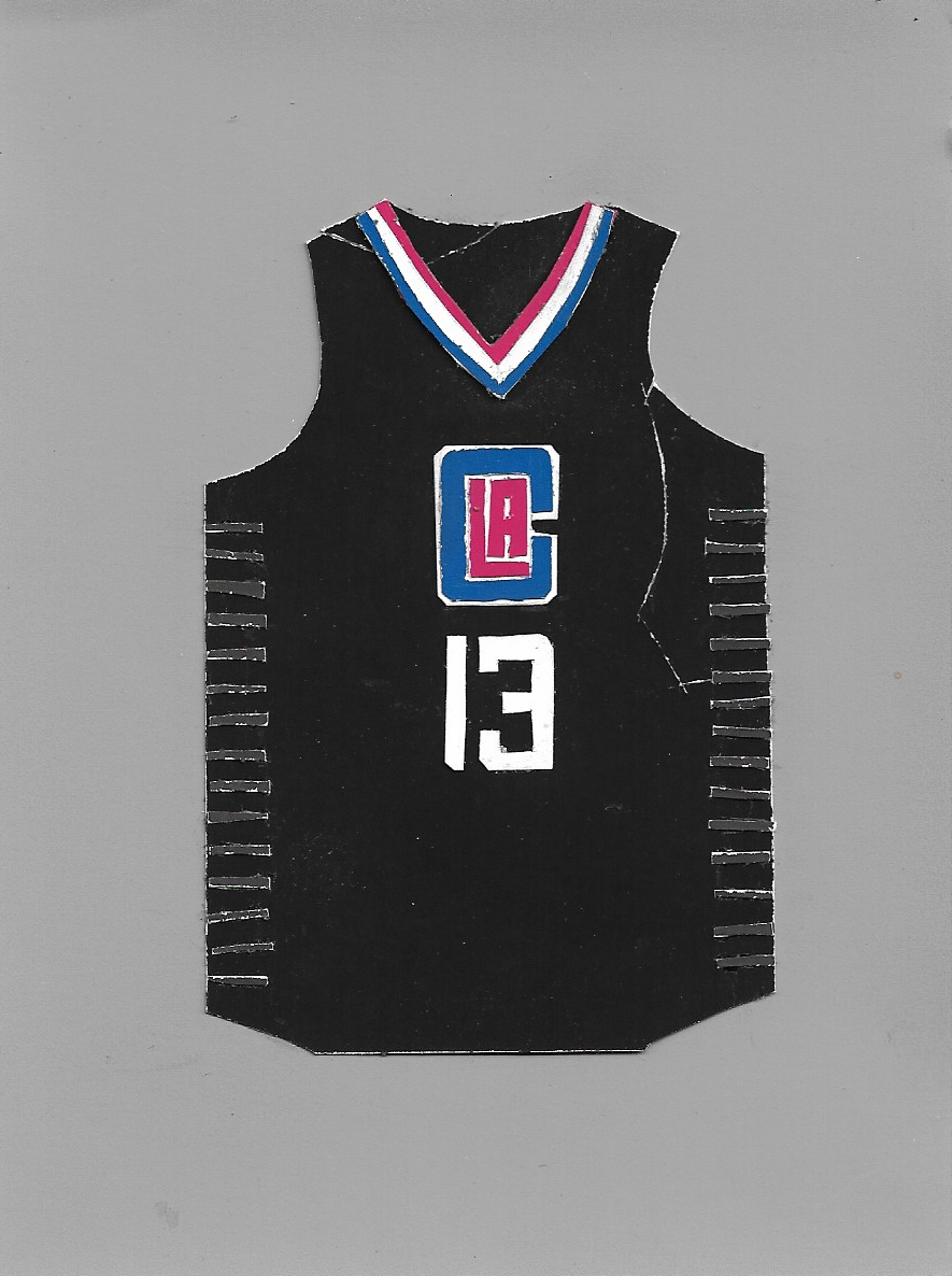
Los Angeles Clippers Statement Edition
(Paul George)
The Clippers have some of my least favorite jerseys of the current Nike partnership. These black Statement Editions are my favorite if I had to pick one. I prefer a wordmark across the chest in general, and although I like this LAC monogram, the jersey feels strangely weighted with it placed directly above numbers of about equal size. There is no spacial hierarchy between the monogram and the number, which is unappealing to me. The tri-color collar trim is nice, but also feels like a different design language than what is found on the shorts. These need work.

_______
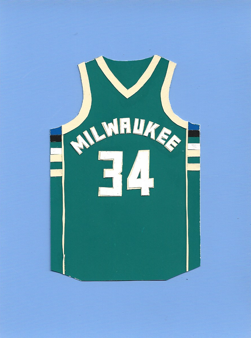
Milwaukee Bucks Icon Edition
(Giannis Antetokounmpo)
The Milwaukee Bucks had a hugely successful rebrand back in 2015, introducing a highly distinct and locally inspired color pallette. The main home/away jerseys remained about the same throughout the transition from adidas to Nike back in 2017, and rightfully so. With their transformed color pallette, the Bucks’ contemporary jersey set is distinct and well designed with its custom typography.


_______

Indiana Pacers City Edition
(Victor Oladipo)
The Pacers’ current City Edition uniforms are great. Truly inspired by their locale, these uniforms utilize a finishline-flag checker pattern down the front in an asymmetrical composition, a nod to car racing in the state. Also one of the few jerseys on which I find that the sponsorship logo does not disrupt the design that badly, and is about as tasteful as jersey advertising can be. One thing that I would have designed differently would be to make the checkered panel continuous through the waistband of the shorts, making it one solid line down the front of the jersey. Nonetheless, these are one of my favorite designs in today’s NBA.

